Most service-business websites do not lose jobs because the design looks dated. They lose jobs because the visitor lands on the page and has to figure out what to do next.
That is the whole game in the first 10 seconds.
Your site should answer four things fast: am I in the right place, do you handle my problem, do you serve my area, and should I call now or request an estimate? If any of that is fuzzy, the visit stalls out. And when the visit stalls out, the homeowner does what homeowners do. They back up and call the next company.
Most Service Websites Have a Routing Problem
Most service websites do not have a design problem. They have a routing problem.
I keep seeing the same pattern. The homepage looks fine. The logo is fine. The photos are fine. Then the visitor gets one vague button that says “Contact Us” and has to do the rest of the thinking. I’ve reviewed dozens of websites for clients, and that is the issue I run into most consistently — a customer who needs service right now and a customer who wants to plan something for next month are hitting the exact same button. “Contact Us” does not tell either of them what to do. It just stalls them out.
That works poorly for a high-intent visitor.
If I have water on the floor, I do not want to decode your brand message. I want to know whether you fix burst pipes in my area and whether I should call right now. If I am pricing a roof replacement, I want to know if you handle that kind of work, whether you serve my city, and how to ask for an estimate without bouncing through three pages first.
Different visitors show up with different urgency. Your website should sort them quickly. Not make them work for it.
What Happens in the First 10 Seconds on a Service Business Website
A lot of local-service traffic is not casual traffic. Someone with a real problem is on their phone with low patience and zero interest in figuring out what you mean. Nielsen Norman Group found that the first 10 seconds are when most visitors decide whether to stay or leave. Research from the same group found that 57% of page-viewing time happens above the fold — 74% within the first two screenfuls. Google has reported that 53% of mobile visits get abandoned when a page takes longer than three seconds to load. And GA4 defines an engaged session as one lasting longer than 10 seconds — which tells you how quickly a visit either becomes action or becomes a loss.
So your copy has to earn those 10 seconds, but your page speed has to earn them first.
Every real visit matters more now. If your homepage creates hesitation, you are wasting a more expensive click than you were a couple years ago.
How a Vague CTA Kills Service Business Website Conversions
This is where a lot of service-business websites quietly bleed money. They treat every visitor like the same visitor.
A plumbing company sends an emergency call and a remodel estimate through the same contact form. A roofing company puts storm-damage leads and long-consideration replacements on the same button. The first visitor wants speed. The second wants enough detail to feel confident. If your first screen makes both of them stop and think, it is doing the opposite of its job.
The goal is to point the right visitor to the right next step with the least possible effort. Not to say everything.
What the First Screen of a Service Business Website Needs to Do
The first screen does not need to be clever. It needs to be useful.
Name the service in plain English — not a slogan, not a brand poem, just what you do and what kind of problem you handle. Emergency repair, replacement, inspection, quote, maintenance — say the actual thing. City names do more work than vague statements about local expertise: “Serving Denver and the surrounding Front Range” is better than “locally owned and operated.”
Trust signals close the gap before someone picks up the phone — reviews, years in business, response window, licensing, financing, a clear guarantee. Then the next step has to be impossible to miss.
One obvious call-to-action is good. A generic one is not. And for trades specifically, the right CTA depends entirely on the type of work you do.
If you run emergency work — plumbing, HVAC, electrical, locksmith — your phone number belongs in the header, above the fold, on every page. Not in the footer. Not buried in a contact form. The CTA should say “Call Now” or “24/7 Emergency Service,” and it should be a tap-to-call link on mobile. That visitor has a problem right now. Do not make them work for the phone number.
If you do planned work — roof replacement, bathroom remodel, new HVAC install, window replacement — “Call Now” is the wrong first ask. That visitor is in research mode. They want to know if you do the work, if you serve their area, and how to get a price without committing to a conversation they are not ready for. “Get a Free Estimate” or “Request a Quote” is the right next step, with a short form that asks what kind of job it is and where they are located.
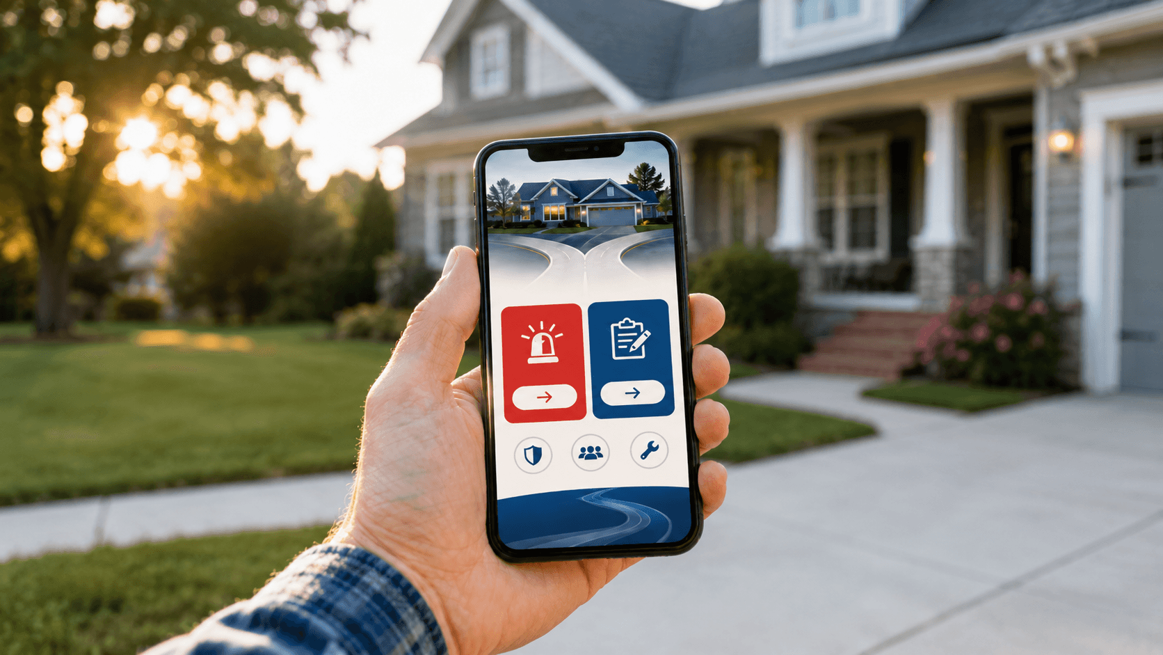
A lot of trades businesses do both. If that is you, the first screen needs two clear paths — not one generic contact button that tries to serve both and serves neither.
Your Service Business Website Homepage Is Not the Whole Job
Another mistake I see all the time: the homepage gets all the attention, and the service pages do none of the selling.
That is backwards.
A lot of your best traffic lands on a service page, not the homepage. Someone searches for “water heater replacement,” “hail damage roof repair,” or “garage door spring repair” and lands deep. If that page does not quickly confirm the service, location, proof, and next step, you lose the lead without ever getting the chance to make your pitch on the homepage.
So run the same 10-second test on your top service pages. Can someone tell what this page is about, whether you do that work, whether you serve their area, and what they should do next? If not, the problem is not just the homepage. It is the path.
For trades, a service page that is actually doing its job answers a few more things: what signs or situations call for this service, what the process looks like in plain terms (not a wall of text — three sentences is enough), and what it costs to get started or get a price. That last one matters because most trades service pages either say nothing about cost or try to explain every variable. Neither works. A simple “most jobs in this range” or “free estimates on all replacements” does more for conversions than a full pricing breakdown or complete silence.
How to Run the 10-Second Test on Your Service Website
Open your homepage on your phone. Give yourself 10 seconds. What problem does this company solve? Is the phone number easy to find? Is the next step obvious? Does the page feel built for an urgent lead, a quote lead, or both?
Do the same thing on your top three service pages.
If you want the honest answer, hand your phone to someone outside your business and ask them the same questions. Do not explain anything. Watch where they hesitate.
That hesitation is the leak.
Then look at the numbers behind it: mobile load speed, click-to-call taps, form starts versus completions, exits on service pages, whether emergency leads and quote leads are both hitting the same generic path. This is the part most people skip. They tweak colors, rewrite a headline, move a button two inches. The actual problem is that the site never made the next step feel obvious in the first place.
Fix This Before You Buy More Traffic
More traffic does not fix a confused page. It just makes the waste bigger.
If your site is unclear in the first 10 seconds, every extra dollar you spend on ads, SEO, or Local Services Ads is pushing more people into the same hesitation.
Fix the path first. Get the service, the area, and the right next step onto every page that gets real traffic — and make each one impossible to miss. Do that, and the rest of your marketing gets easier. Not because the website became prettier, but because it stopped making good prospects think harder than they needed to.
That is the real job of a service business website. Point the right person to the right next step fast enough that they do not have to wonder what to do.